Data visualization is basically an effort that helps people understand and analyze data with the help of proper visuals, say graphs, patterns, or correlations. In simple, it is the extraction of information from a text format and presenting it in a pictorial format. This makes the final outcome much more appealing, easy to understand, in some cases, even predictive.
Importance of Data Visualization
As is said, “A picture is worth a thousand word”, this quote goes exactly hand-in-hand in case of data visualization. Today, the world is controlled by Big Data. Long gone are the days where IT people were required to prepare reports for the non-technicians. But today, Google’s Data Studio allows user to create visualizations and dashboards without any knowledge of coding. Data visualization is an essential ingredient which helps to transfer the potential of Big Data mainstream. Also, information via images can be processed 60,000 times faster than its text format counterpart.
Functions & Applications of Data Visualization
One of the basic utilities of data visualization is being informative. Representing data via pictorials, patterns provides ease of understanding the problem, which is otherwise difficult to get with numbers and other data. Visualizations of dashboard act as analytical tools. They contain various filters and variables which can be adjusted accordingly to give the desired output. Analyzing data is yet another benefit of data visualization. Patterns emerge quickly and with much ease. With visuals, it is easier to communicate the desired results to the clients. Data visualization proves that there is a greater probability to track new business opportunities, predict upcoming trends or sales volumes and the revenue they would generate, and be less subjected to day-to-day fluctuations and surprises.
It is a fact though that Tableau is an ace in this field. But even each and every data analysis tool have their own set of libraries and packages for data visualization purposes. Python uses packages such as matplotlib to visualize. In case of R, it is ggplot. SAS on the other hand, has a separate graphics section for this. Excel has its charts section in its ‘insert’ tab.
Developing Data Visualization
Data visualization can be developed in various ways according to our convenience. Audiences’ preference may vary. Some may be top-down learners, they learn best when the summary is provided, whereas some prefer finer fields with detailed analysis. Development happens when a visualization analyst tells a story using the data. As combining different visuals together in a dashboard brings forward a sequential discovery of facts. Visuals may be of different types like word cloud, bubble chart, heat maps, weather forecast, etc.The target audience is an essential factor as interpretation of the data depends on them.
Critical Junctions of Data Visualization
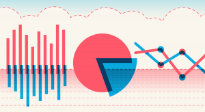
To make the idea comprehendible to the target audience, data visualization is always aided with either pie chart, or histogram, or line diagram along with some colour modulations. Even then, in some cases, it can be distracting if too much of colour combination is used. It is thus, important for a visualization analyst to avoid too many patterns or embellishments. As this not only requires excess time and energy but also dissatisfaction of clients.It has huge potential to create complex as well as accurate forecasts, the only glitch being: its solutions have to be scalable to a large audience and available through multiple delivery channels.
Data visualization is still in its infancy.It needs to be developed much more as it is the future of presenting. An ideal situation would be when it can extract insights from raw data with the help of heuristic-systematic models.